Posted on May 29, 2023
21 Healthcare Website Design Examples, Tips & Techniques
Healthcare website design is critical for medical organizations looking to compete in today’s digital landscape.
For doctors and providers of all types, your website design allows you to better communicate your services, increase visibility online, and turn more visitors into patients. This requires combining attractive visuals, user-friendly interfaces, and valuable content like media and informative articles about your offerings. When done well, your site attracts new patients and builds trust in your services.
Easier said than done. You already understand the benefits and importance, but what should you implement in a healthcare website design to achieve these goals?
The best sources for inspiration are examples.
Why Good Design Matters for Healthcare Websites
A recent study by the Journal of Business Research found that on average, 96% of website visits result in no conversion. That means you may only have 4% of your total traffic available to convert into appointments.
If a major end goal for your healthcare organization is using a website to book appointments with new patients, the website design has to optimized and utilize proven tactics to make every user visit count.
Beyond the statistics; a professional, well-made medical website design also brings psychological and technological benefits that impact all facets of your online performance.
21 Outstanding Healthcare Website Designs & What Makes Them Great
A healthcare website design is a work of art. After designing three thousand websites for medical organizations, we’ve learned what works and what doesn’t.
Below are 21 healthcare website examples that implement a critical design factor component into their overall website design. These examples can serve as a practical course in healthcare-related web design principles and a definitive source of inspiration.
1. User Experience (UX)-Focused Healthcare Website Designs
UX design encompasses the overall aspects of usability, functionality, accessibility, and aesthetics of a healthcare website to meet your patients’ needs, expectations, and preferences. It starts right at the beginning with the wireframes.
How these website designs use UX well:
2. Healthcare Websites with Intuitive UI Layouts
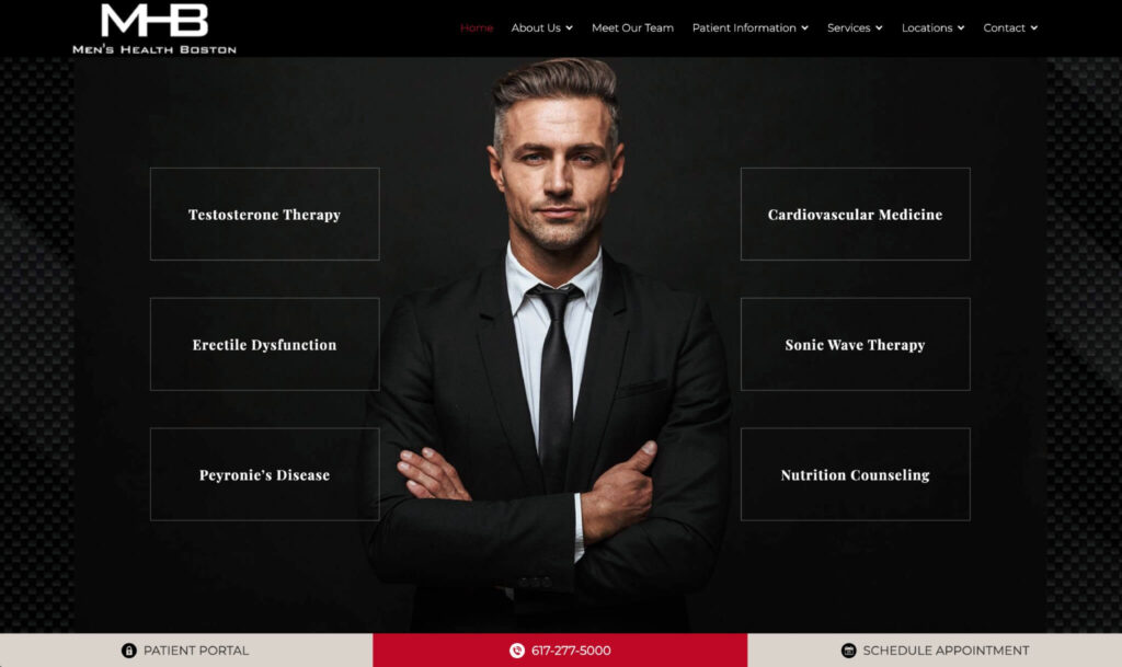
UI design involves choosing and arranging the website’s visual elements, such as colors, fonts, media, icons and buttons, and creating a consistent and coherent style and layout that is visually appealing, intuitive and easy for patients to use.
How these website designs do UI well:
3. Mobile-Optimized & Responsive Healthcare Website Designs
Responsive and mobile-first design means your website adapts its visual layout to different screen sizes and devices. Doctor websites that are responsive utilize development techniques such as fluid grids, flexible images and media based styling queries to adjust the website’s layout and content according to the screen size and resolution. It’s important to keep information and visual elements consistent across different devices and screen sizes.
How these website designs focus on mobile:
4. Websites With Strong Branding and Visual Identity
Branding and visual identity create a distinctive and recognizable voice, message, and identity for a company. Strong and memorable branding helps healthcare practices stand out from competitors while influencing patient perception of a provider. Assets such as logos, colors, and style and tone of voice used in content and messaging are all items under the branding umbrella.
How these website designs use branding:
5. Using Branded Videos & Imagery to Enhance Engagement
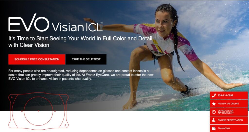
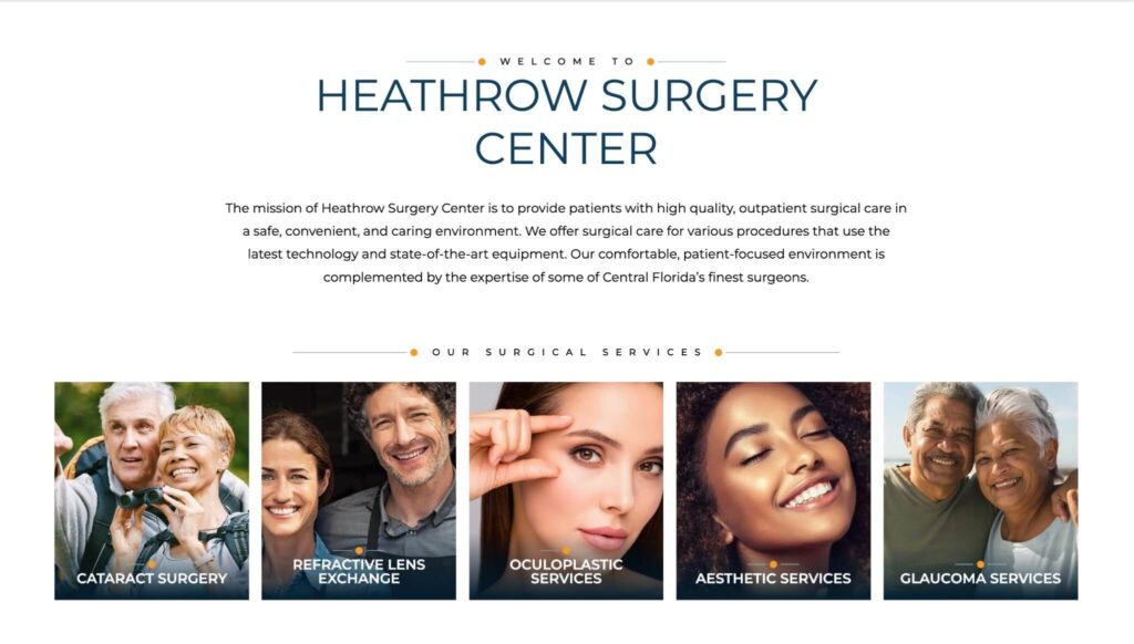
Videos and imagery are the media elements of a healthcare website, such as anatomical photos, educational videos, icons and illustrations that support the website’s content and goals, attract the patients’ attention and evoke emotions and associations. They directly tie into UX, UI, branding and the content components of any medical provider’s website.
How these website designs utilize imagery:
6. Showcasing Reviews and Testimonials
Reviews and testimonials are the feedback and opinions of previous or current patients. These are so important for providing social proof, credibility and the trustworthiness of a doctor. They act as trust signals to patients and those considering your services.
How these website designs highlight reviews:
7. Secure Forms
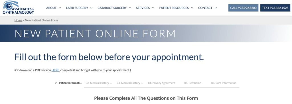
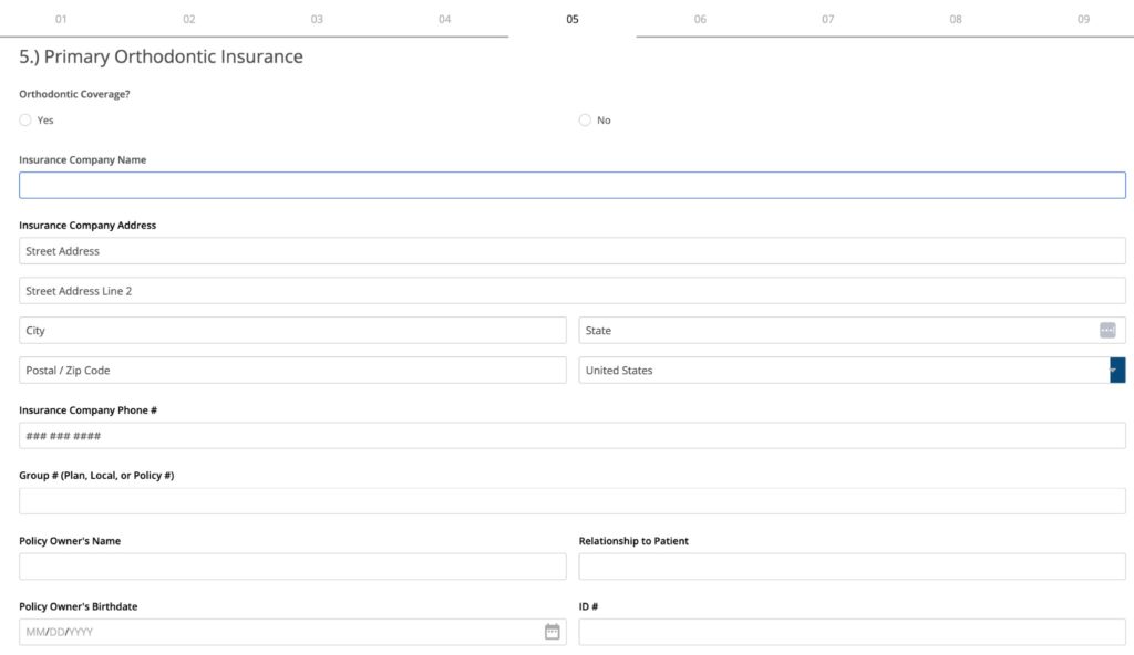
Forms are an essential part of a website for any medical organization. They are used for lead generation, gathering reviews, collecting patient information to reduce paperwork, and serve as educational tools when used for things like self evaluation quizzes. When using forms on a medical website, make sure the forms are HIPAA compliant and you are using HIPAA compliant email to receive submissions.
How these websites use compliant forms strategically:
8. Easy to Use Online Appointment Scheduling
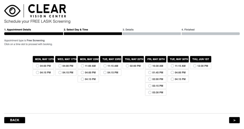
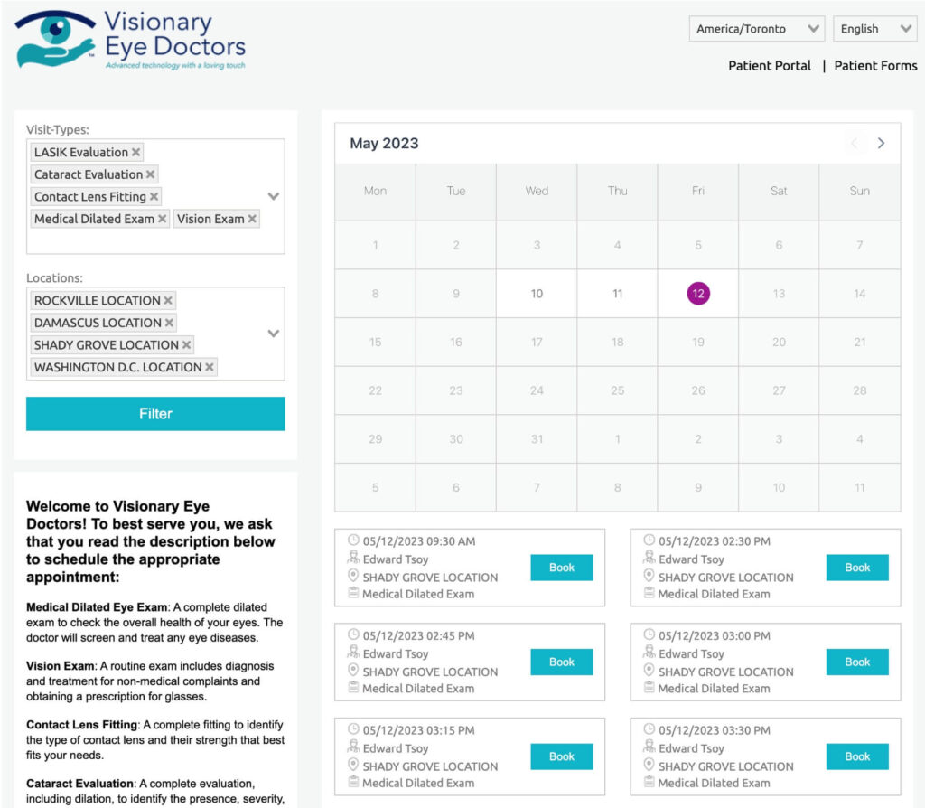
In 2023, patients expect the ability to schedule an appointment directly on healthcare websites. Users are looking for a doctor who can see them soon and at a time that fits their schedule. Online appointment booking software such as Appointec solves this issue and provides practices the ability to schedule patient appointments directly on their website.
How these website designs use online schedulers for simple booking:
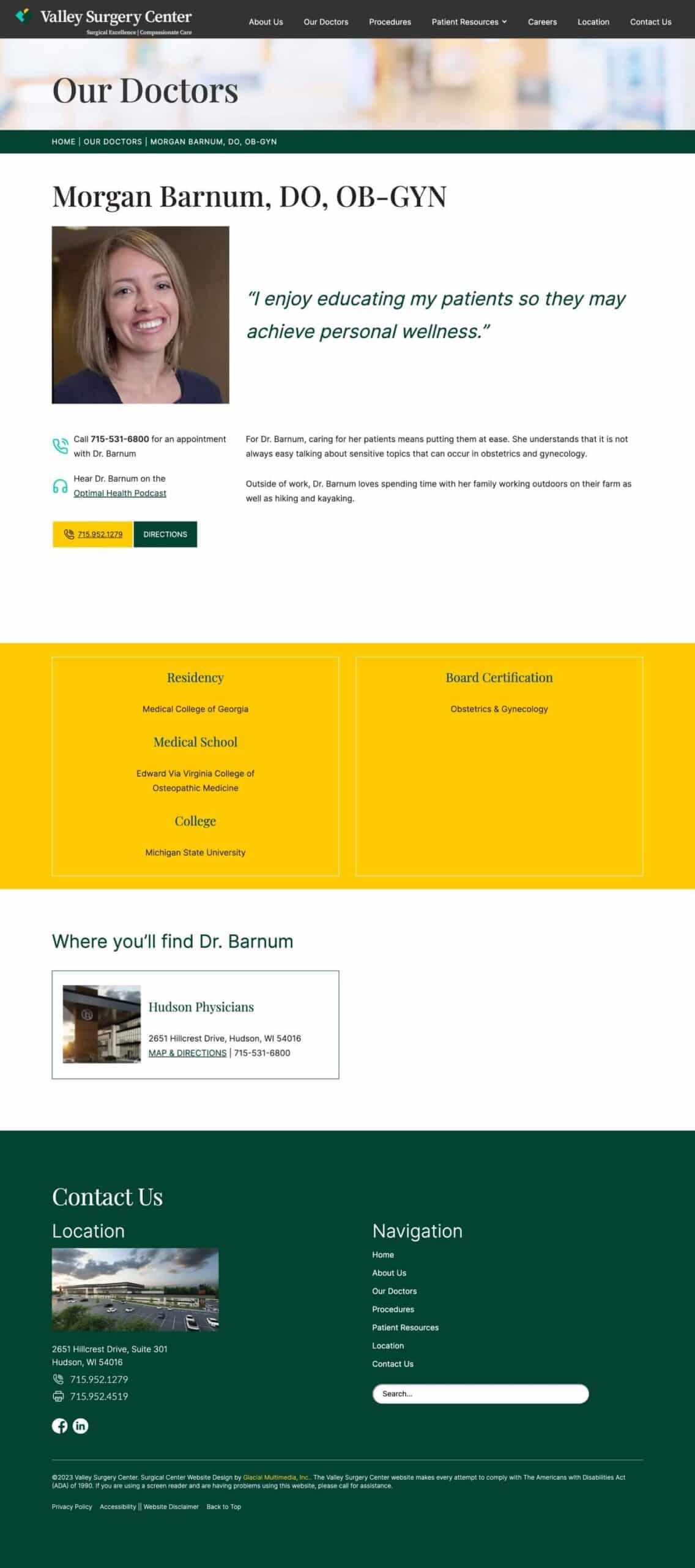
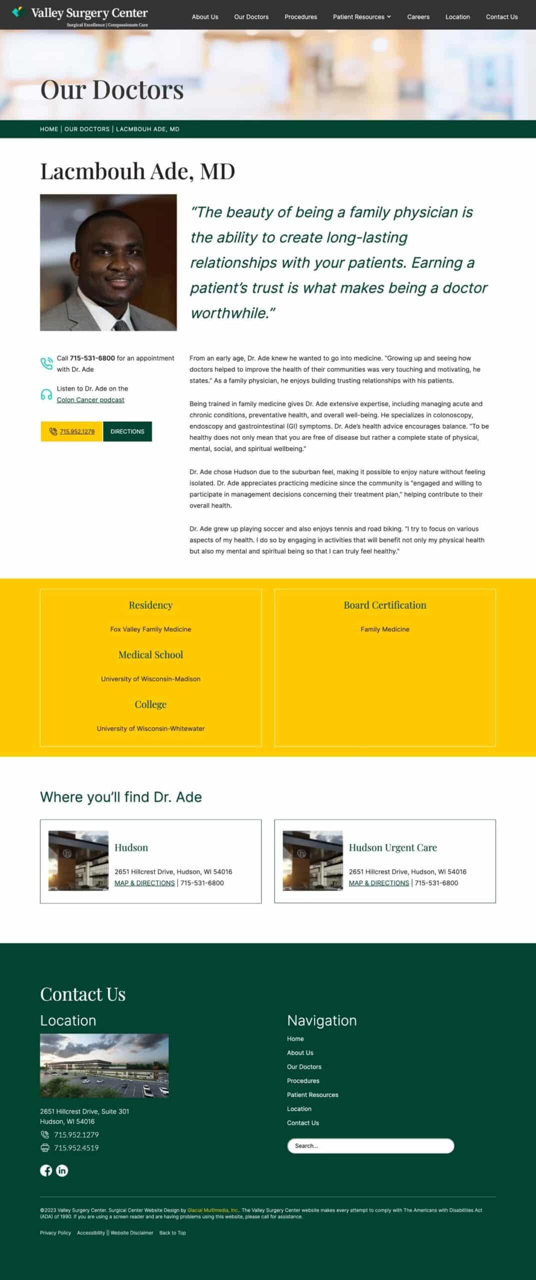
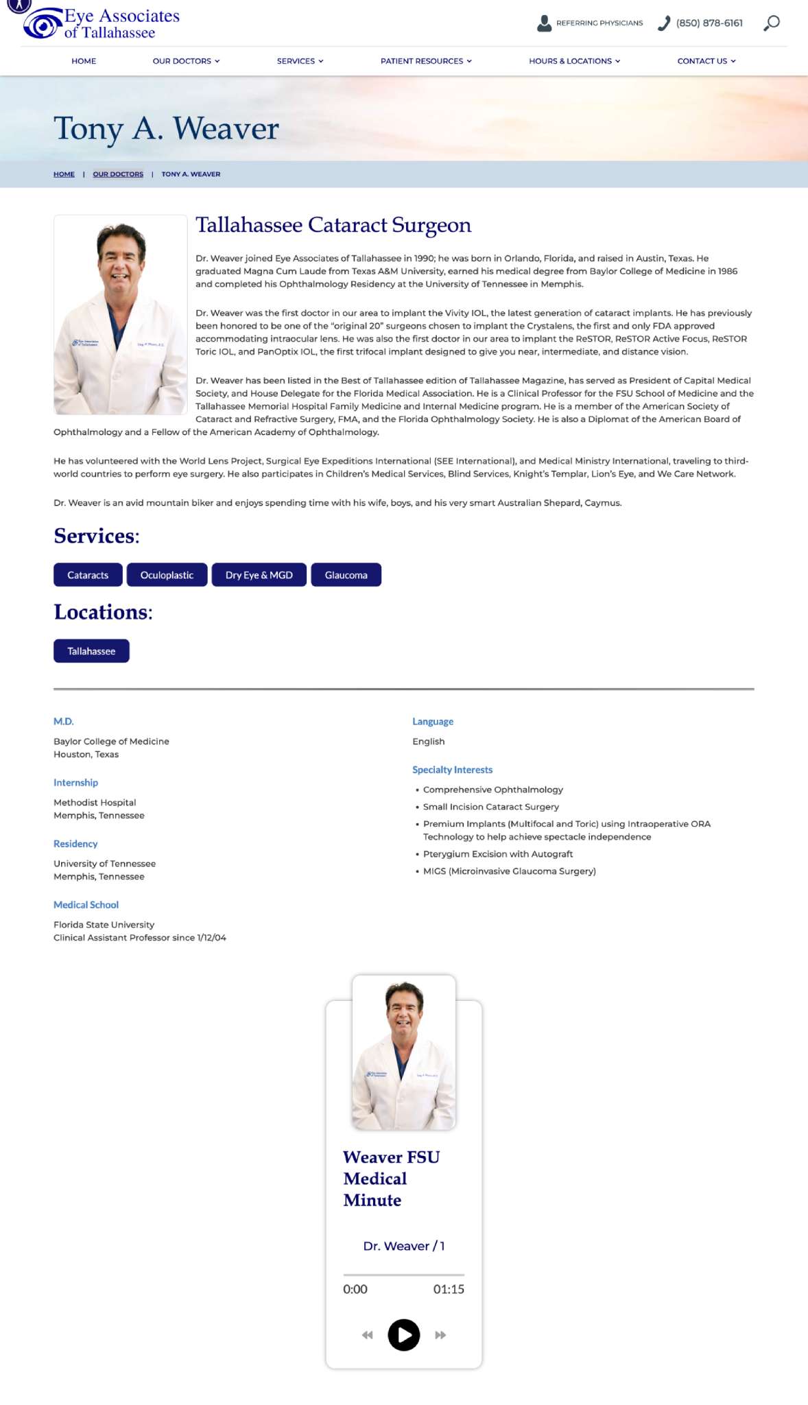
9. Doctor Biography Pages with Personality
Doctor biography pages are the sections of a healthcare website that provide information on the doctors who work at or are affiliated with an organization. It’s important to display things such as a photo, experience, links to publications, specialties and locations served. It helps build trust and confidence with prospective patients, while showcasing the medical talent available at your clinic.
How these website designs built trust with their doctors:
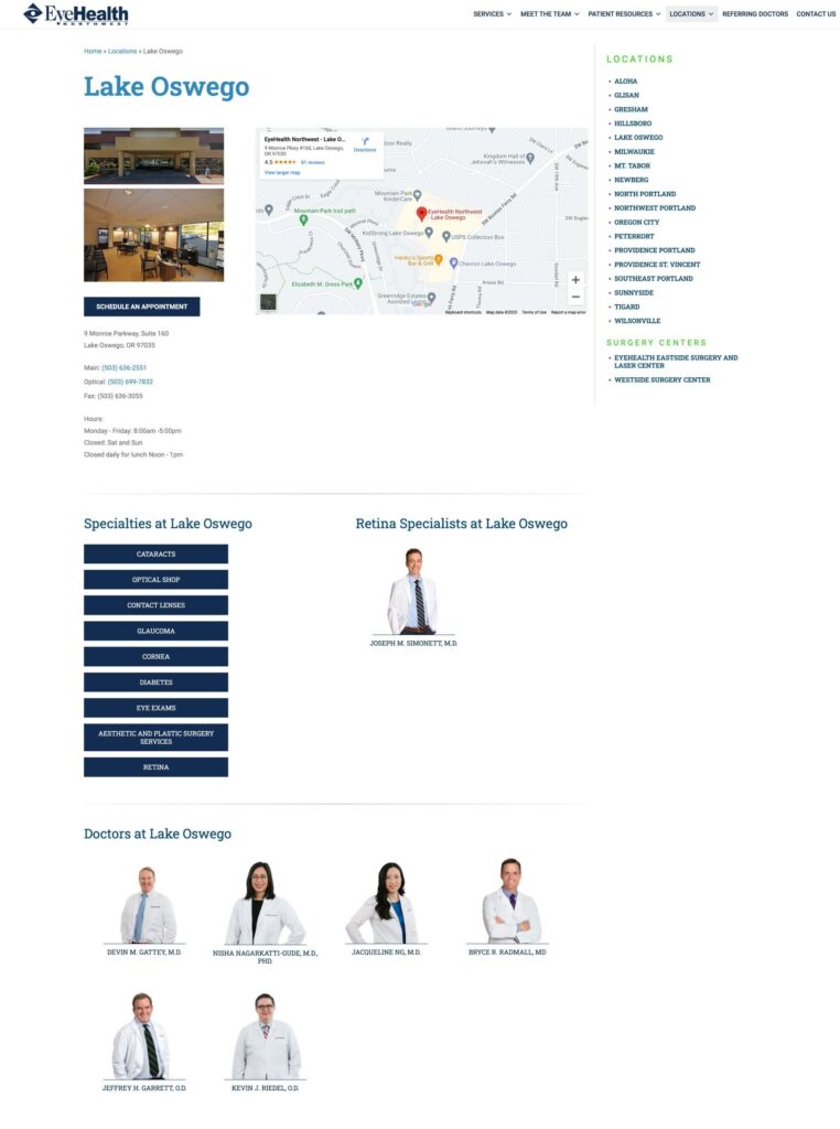
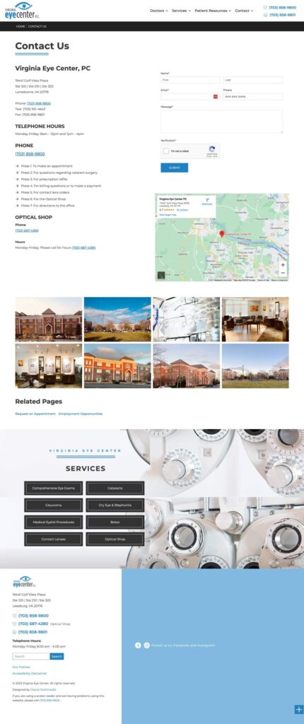
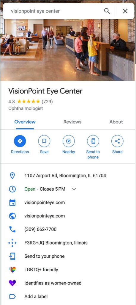
10. Informative Location and Contact Pages
Individual pages for each clinic location and easy to find contact information are a must-have for healthcare website designs. The location pages play a role in SEO and provide an opportunity to rank higher for local search queries. You need to have accurate and up-to-date phone numbers, addresses, hours of operation, services provided, and maps with directions on each location page. Bonus points for including things like reviews, specific doctors who work at each location, and profession photos of the office interior.
How these website designs make location pages:
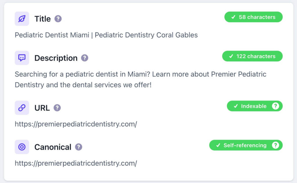
11. Healthcare Websites with SEO-Friendly Site Structures
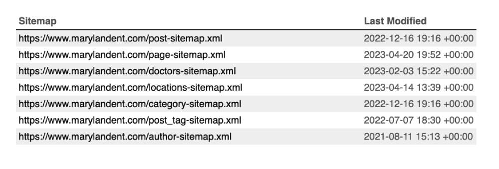
SEO refers to improving on-page and off-page elements of a website in order to increase ranking positions on search engines such as Google or Bing. Higher rankings mean more traffic and more potential patients. SEO for medical websites involves using techniques such as keyword research, content creation, link building and technical optimization to make the website relevant, valuable and authoritative for users’ search queries.
How these website designs implement SEO:
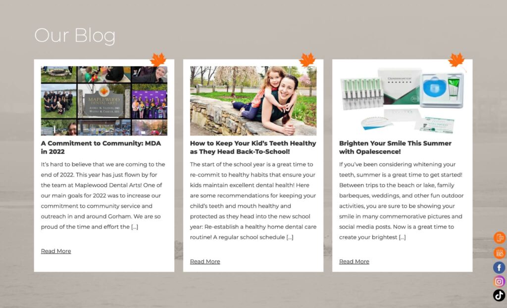
12. Blogs and Content Marketing for Topical Authority
Blogging is the number one content marketing strategy for healthcare websites. As such, your design must allow for quickly consuming and publishing content while ensuring it follows technical SEO best practices. Original educational content, images, video and audio are great ways to establish yourself as a trusted and authoritative online resource.
How these website designs showcase authority:
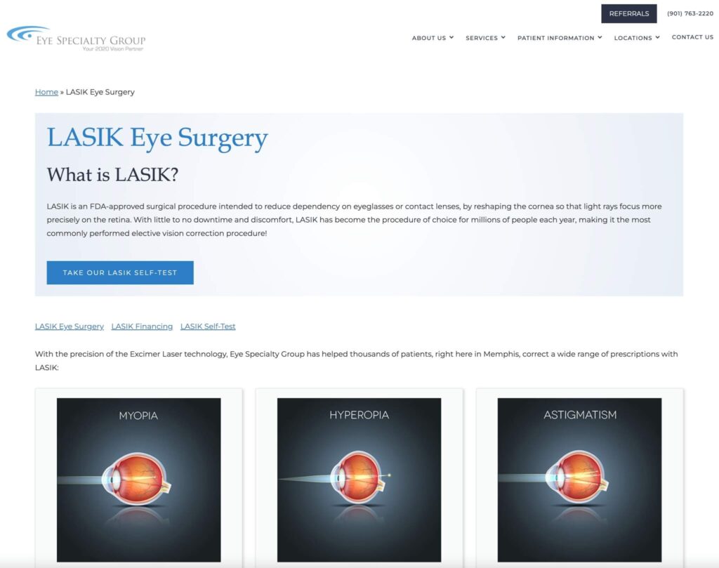
13. Engaging Educational Resources for Patients
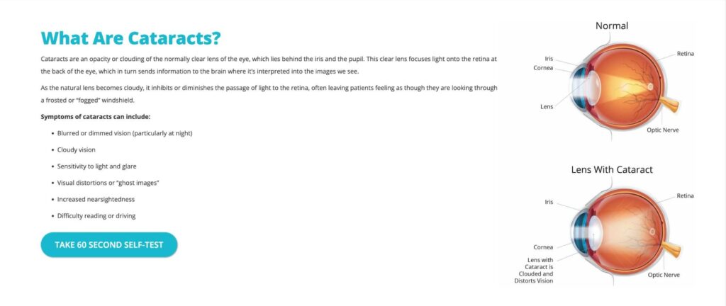
Educational resources are the materials on a medical website that provide information and guidance to patients on various health topics such as symptoms, diagnosis, explanations, and tips using blog posts, media, videos, recordings, e-books, self-tests, and online courses. These things can also be used as lead-gen magnets for new patients. Medical practices should ensure educational elements are part of their healthcare website design, either by creating some themselves, or by purchasing third-party assets to have added to the website.
How these website designs provide educational resources:
14. High-Converting, CTR-Optimized Healthcare Landing Pages
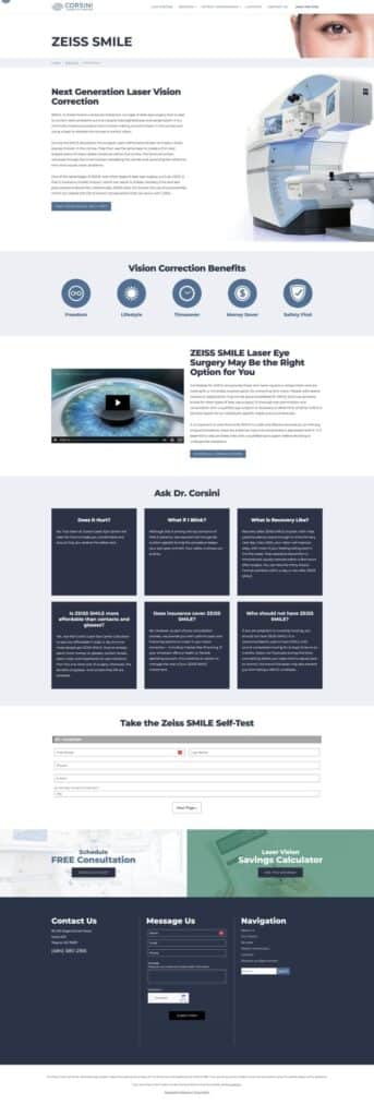
Landing pages are an essential lead-gen tool within a healthcare website design and the secret weapon of all successful medical paid search campaigns. A best practice is to have them be an isolated page within your website, with a focused message and single call-to-action such as booking a consultation. Landing pages also help to optimize ROI of marketing campaigns through better tracking and positioning, thus lowering the cost per lead (CPL) and cost per acquisition (CPA) of each campaign.
How these website designs layout Landing Pages:
15. Strategically Placed Engagement Objects
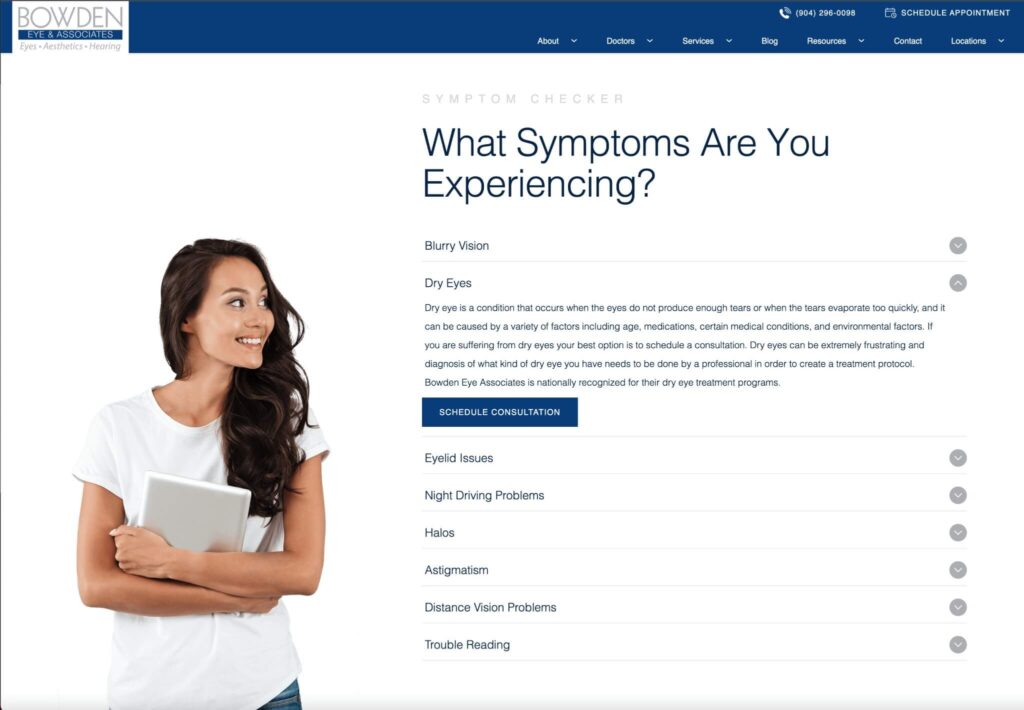
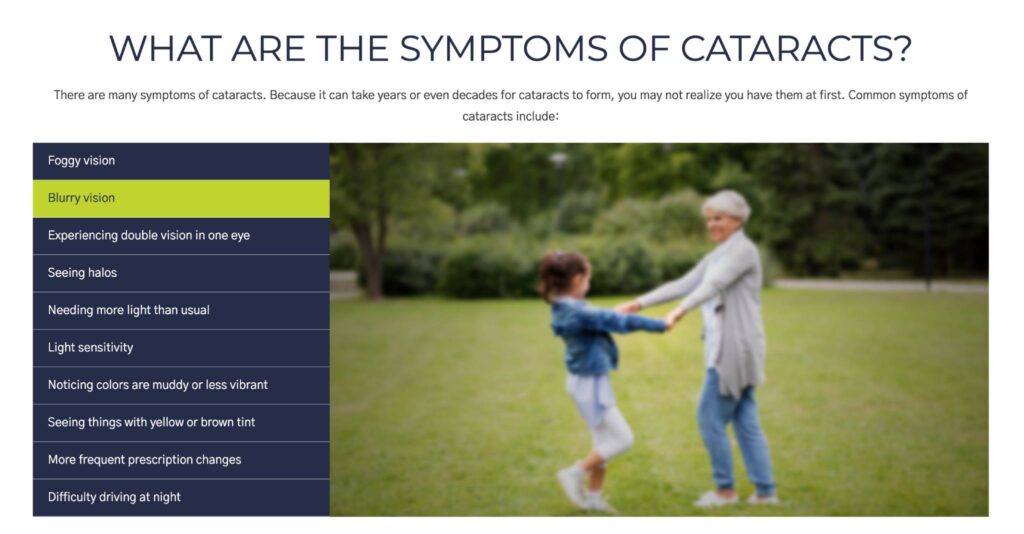
Engagement objects are the elements on a website that encourage patient interaction or participation. A medical website design can include engagement objects in the form of buttons, symptom checkers, quizzes, engagement panels, and anything that encourages a user to interact and take an action. Each page should have at least one clearly marked engagement object present.
How these website designs present engagement objects:
16. Websites Using Effective CTA Strategies for Conversions
Conversion rate optimization refers to improving the conversion rate of a website or page. Essentially, you are trying to increase the number of patients who take the desired action. Healthcare website designs can experiment with CRO by adding engagement objects, adjusting UI elements and verbiage while tracking results using A/B testing, heatmaps, analytics and user feedback to identify and eliminate the barriers and friction points that prevent patients from taking action.
How these website designs implement CRO:
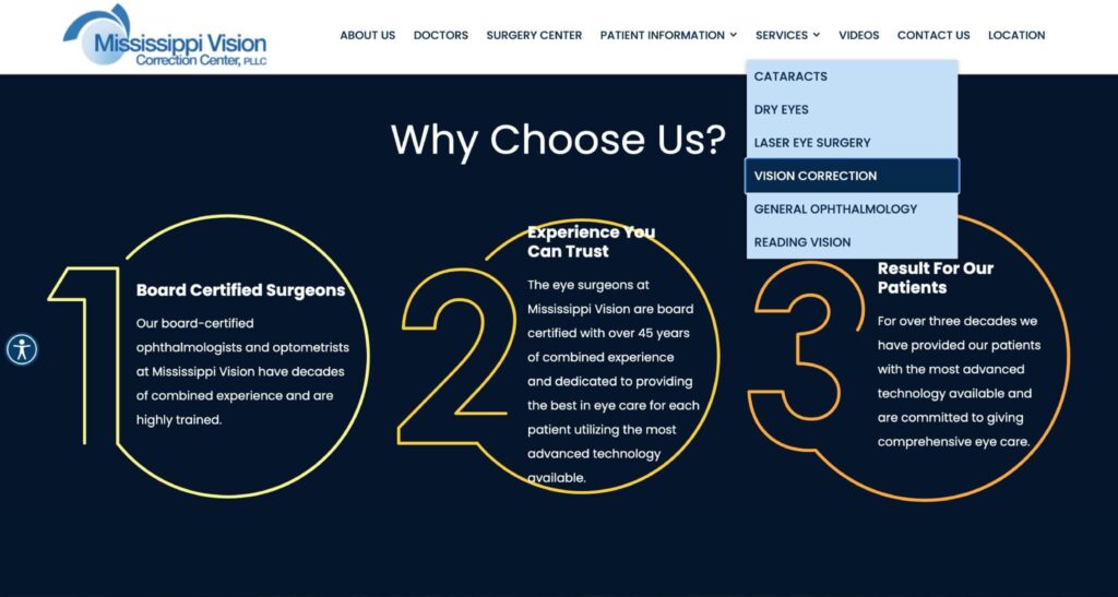
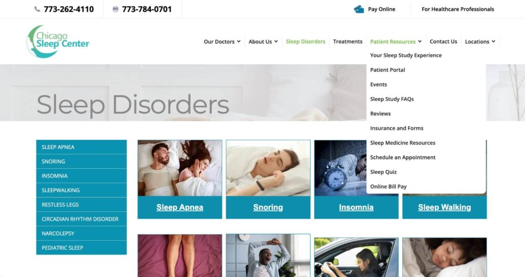
17. Clean Navigation and Menus
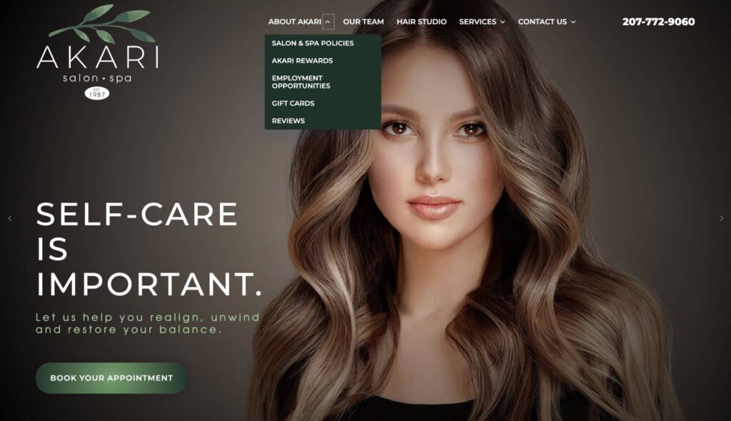
Navigation and menus are the components of a website that allow the users to move around and explore the different pages and sections of the website. In medical website design, a well-designed navigation provides a clear and logical structure and hierarchy for the website’s content, improving the overall UX, accessibility and making it easier for search engines to crawl the website. Navigations and menus also need to be responsive and mobile friendly.
How these website designs structure intuitive menus:
18. Important Items Above the Fold
Items “above the fold” are everything users see (without scrolling down on the screen) when they first load a website. The fold refers to the top and bottom of your screen window. Items above the fold are interconnected with UX/UI, engagement objects, navigation, and especially load speed and performance.
How these website designs format Above-The-Fold:
19. Designs with Organized Information Architecture
Information architecture is important when designing a healthcare website because it determines how its contents are organized, structured and labeled. This influences the user experience and how search engines understand what your website is about and what it provides. The key is to ensure your information is easy to find, understand, and associate with what parts of your website are connected. Navigation and interlinking between pages are critical components of information architecture.
How these website designs organize information:
20. Designs that are Accessible to All
Accessibility is a critical aspect of not only healthcare website design, but all website design. Your website should be usable by everyone, regardless of their abilities or disabilities. Standards such as WCAG (Web Content Accessibility Guidelines), ARIA (Accessible Rich Internet Applications) and ADA (Americans with Disabilities Act) exist to ensure that the website is perceivable, operable, understandable and robust for all users, including those who use assistive technologies such as screen readers, keyboards or voice commands. Over the past few years, the number of accessibility lawsuit cases have increased against medical practices, and it is important you make efforts for your website to be accessible to all patients.
How these website designs ensure accessibility:
21. Security and Compliance
Security and compliance for a healthcare website is wide ranging but comes down to protecting patient data, staying up to date on current laws, and securing your website against malicious actors. Not to mention, things such as data breaches, site hacks, and even little things such as not using an SSL can negatively impact user perception of your practice.
How these website designs stay secure:
Essential Guidelines for Effective Healthcare Website Design
1. Selecting the Right CMS
The CMS you choose will set the foundation for your website. Medical website designers are smart to choose a CMS that is flexible and easily customizable, yet feature rich and has a large open-source community around it. If you are selling product, make sure the CMS has e-commerce abilities and integrations.
2. Focus on the Patients You Serve
A healthcare website is built to serve the needs of patients. What will they be coming to your website for? When creating your design, put yourself in your patient’s shoes. Why will they find you? What solution will they be looking for?
3. Do Your Research
Study not only other medical websites, but also the latest digital health and design industry trends for what new technologies, strategies, or tools you can incorporate. Additionally, vet any web designer you look to work with and make sure they have skills to match your desired outcome.
The Role of AI in Modern Healthcare Website Design
AI is set to impact all areas of technology, including medical website design. We are already seeing AI being integrated into tools that are added to websites, such as chatbots, and generative AI technology is being integrated into the creative process across disciplines.
The most likely areas artificial intelligence and machine learning will have an impact on healthcare website design in the short term are:
- Layout ideation and breaking through creative ruts.
- AI-powered chatbots, which can provide 24/7 support to website visitors, answering common questions, helping with appointment scheduling, and guiding users to relevant resources on the website.
- Analytics and UI/UX optimization tools that use AI to analyze user interactions on the website and identify areas for improvement in the user interface and user experience.
- Personalization and dynamic content for providing tailored content recommendations based on previous website interactions from a user.
That said, while AI can be a powerful assistant for any web master or designer, it is not a silver bullet for creating great healthcare websites. Organizations need to be aware of potential risks around user privacy and security, ensuring PHI is not shared with non-compliant systems or users. And while generative AI is fantastic for creative brainstorming, without well crafted prompts and an actual eye for design, outputs tend to be those of the lowest common denominator. Uninspiring, basic, and coming out at the same skill level you would expect from that friend who has a kid who dabbled in web design once.
Proven Techniques to Improve Healthcare Website Design
Designers and developers will be well served utilizing these techniques when creating a healthcare website design. Used wisely, they will be on a sure path to establishing a superior design that resonates and serves your patients effectively.
- Good UX is the core of any web design in healthcare.
- An Intuitive UI is all in the position of elements within a healthcare website design layout.
- Designs should be responsive and mobile friendly.
- Incorporate strong branding and visual identity throughout.
- Use videos and imagery to engage visitors.
- Utilize reviews and patient testimonials to build trust.
- Use secure, HIPAA compliant forms on your website.
- Have online scheduling options available for patients to book appointments directly.
- Make sure doctor pages help patients get to know the provider.
- Location and contact pages must be up to date.
- Make SEO a central focus of your design.
- Content marketing can be the difference between first and tenth position.
- Educate patients as much as possible.
- Landing pages are key for paid search campaigns.
- Engagement objects help turn visitors into leads.
- Test different types of calls to action.
- Navigation menus define the information architecture of your website.
- Optimize page experience above the fold for website load times and performance.
- Structure the content and pages of your website in a logical order.
- Make your design accessible to all.
- Implement strong security and follow industry compliance requirements.


